| This article is relevant for io.network Principal Member subscriptions only. |
The relevant users will be interacting with the asset management dashboard to obtain accurate, up to date and consistent information.
Glossary
- Sender address: Related to the remitters cryptoaddress
- Receiver address: Related to beneficiary cryptoaddress
- Sender client: Refers to the sending underlying client
- Receiver client: Refers to the receiving underlying client
- Transaction ID: Unique combination of number and letters pertaining to a transaction arising
- Amount: The transaction amount sent
- Created at: Date the transaction was created
- Public Address (key): A public key allows you to receive cryptocurrency. Every address is secured by a private key, in our case, this private key is secured by the vault
- Transaction Status: The status pertaining to an actual transaction, will either have 'COMPLETED' or 'CONTRACT FAILED'
- Asset: Referring to the actual asset under question
- Mint: Minting crypto is creating new digital coins or tokens on a blockchain network
- Burn: Burning refers to a deflationary process that permanently removes asset tokens from circulation
Accessing the Network Activity dashboard
As a member of the principal member dashboard you will have access to the io.network activity reporting dashboard, to access the reporting views, you will use the link either within the compliance dashboard or io.network PM dashboard directly and therefore need no further login credentials.
Please note
The initial admin user credentials for the overall dashboard/s will be provided by the io. Customer Office team directly to your account admin user. Once the account admin user is logged onto the system, they can add their own team members by using the adding a team member process in the overall PM user guide.
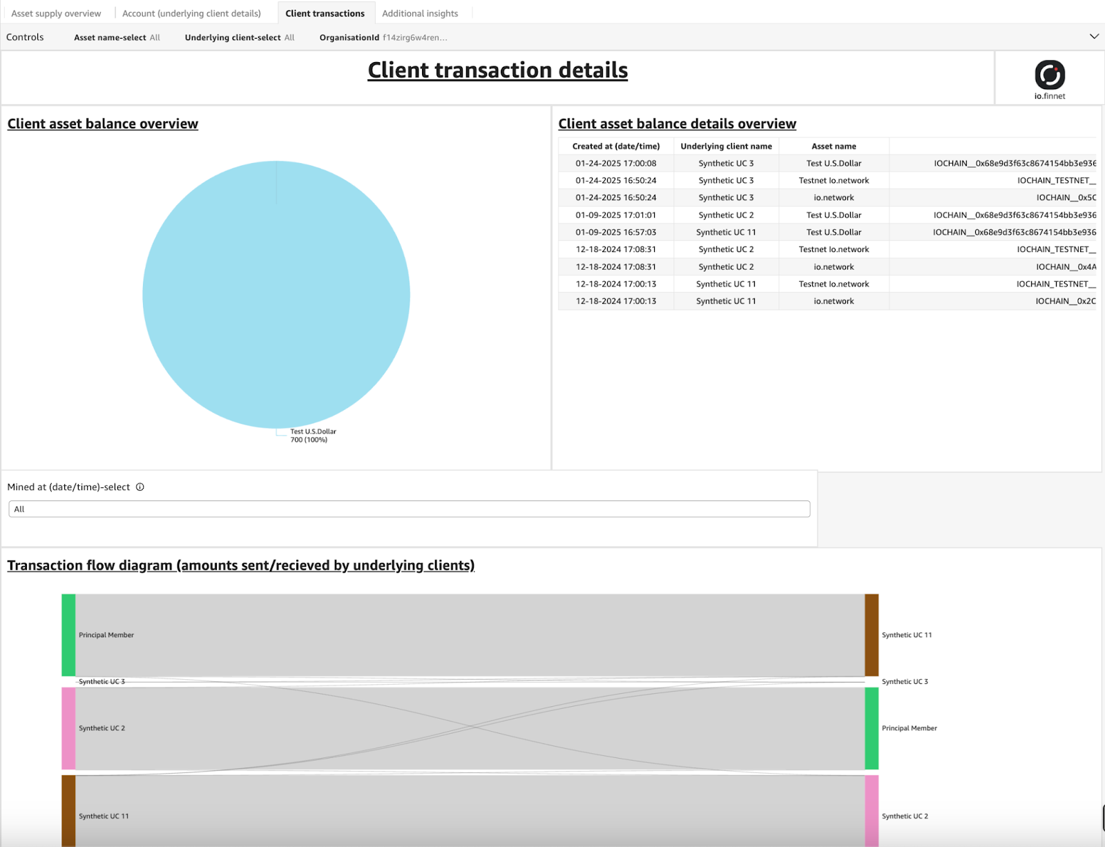
Getting to know the Network Activity dashboard
Dashboard view
The image below depicts the io.network dashboard. As a personnel user you will be using this for operational, analytical and regulatory decision making. This dashboard has the feature of having minimal typing and searching where select filters at the top can allow quick, instant solutions to understanding the data present.
Filter types
There are four types of filters available. These filters are;
- Client Filter
- Date Range
- Timeframe Range
- Custom Filter
Client Filter
The controls depicted below have a drop down option where the user can filter the relevant data. In order to reset the filters to indicate all existing information, you can select the three dots (indicated below) and a reset option will appear.

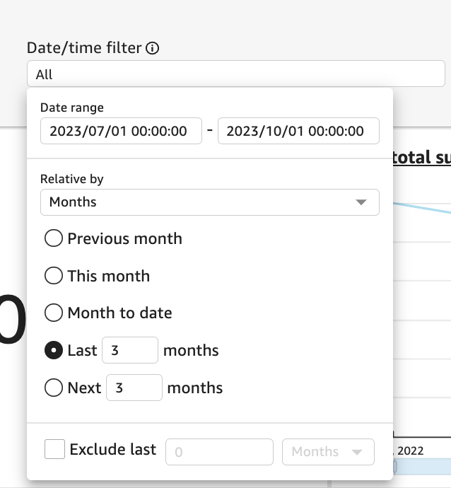
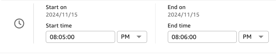
Date Range
The date time range control offers two filtering options:
- Specific Dates and Times: Filter directly by selecting particular dates and their corresponding times.
- Relative Units: Filter by selecting a time unit (e.g., day, week, month, year) and applying it retrospectively from the current date.
Please see some images attached below to illustrate this functionality.
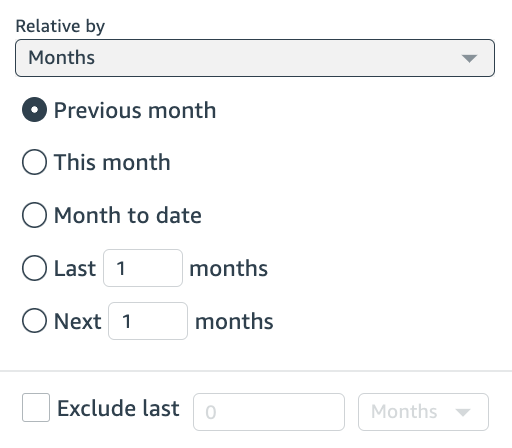
Timeframe range
The visual below demonstrates how filters can display data relative to a specific timeframe, including custom selections (e.g., one month, as shown in the example). While relevant visuals linked to the control filter will update accordingly, not all visuals are compatible with every filter.
This compatibility is indicated within the visual tile itself. For instance, in Section 3.2d, the title of the tile specifies: “Total Asset Supply (Latest Value), Filters by Asset Name Only” (left-hand side). This highlights that only the Asset Name filter can be applied to this particular tile.
Custom filters
Due to the data makeup and/or importance of a particular visual, the user may have certain tiles that will have their own custom filter. This will be indicated with the filter directly above the applicable visual. An example is given below to illustrate this. You can see that the Mined at (date/time) filter only applies to the three visuals depicted directly under it.
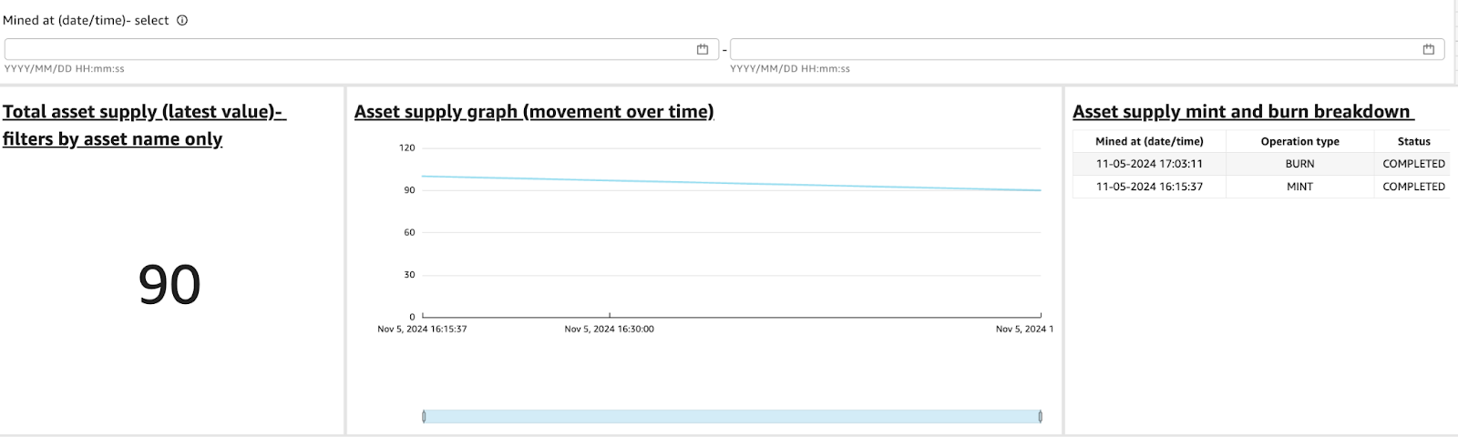
It can be observed from the visual above (for example) that the different entities conducting transactions , this can be generated via a specific filter not altering the dashboard itself.
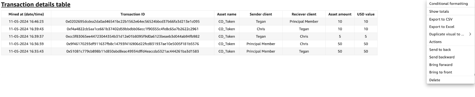
Data Export
An instance may arise where the user may require further analysis to be done on another platform like Microsoft Excel or Google sheets. The Network Activity Dashboard offers the capability to export your visualizations results to Excel (where the data is tabular), other visuals can be exported as CSV (comma separated value) files where needed. This allows the user to quickly disseminate the information to other stakeholders without having to waste time duplicating data generated within the dashboard.
Understanding filters
All filters, such as those mentioned in this section, include an information icon located next to them (refer to the image below). This icon provides users with additional details about the specific filter and its purpose, helping them better understand what the filter is designed to achieve.
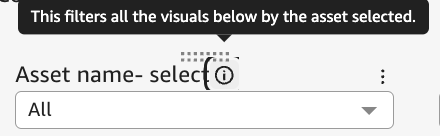
Looking at the image above, we get an understanding that the filter applies to all visuals in that specific sheet (page) and filters by the asset selected.
Need help?
Please refer to support process to raise a ticket with our Customer Support team.